Page 2 of 2
Re: Serindë's Stitching 2025 9 April
Posted: Thu Apr 10, 2025 2:45 pm
by Serinde
It wasn't so noticeable, but it threw the whole design out. Anyway, it's sorted now. Took about 15 minutes.
Re: Serindë's Stitching 2025 8 May
Posted: Thu May 08, 2025 3:03 pm
by Serinde
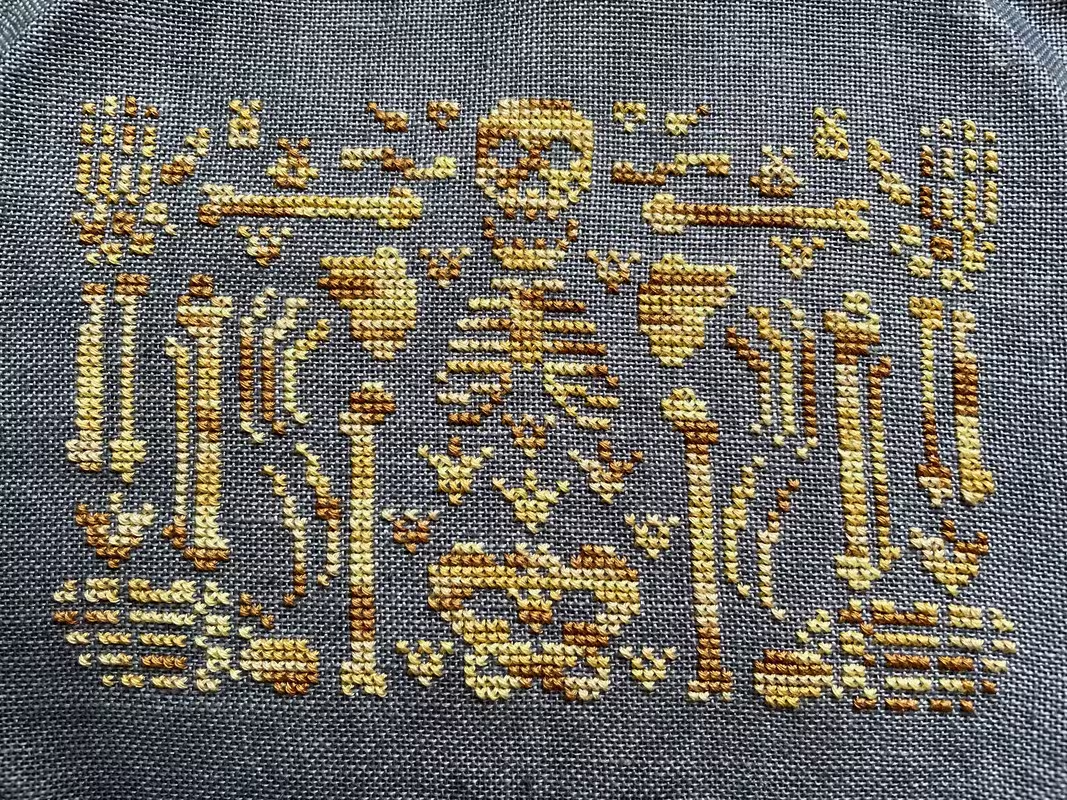
Finished the stitching on Ink Circles' "Assembly Required". Now to get it washed, pressed, mounted and framed.
Re: Serindë's Stitching 2025 8 May
Posted: Thu May 08, 2025 4:10 pm
by Mabel Figworthy
Great finish, and oddly smile-inducing for such a grisly subject

Re: Serindë's Stitching 2025 8 May
Posted: Fri May 09, 2025 8:21 am
by Serinde
It made me laugh out loud when I first saw the design.
Re: Serindë's Stitching 2025 8 May
Posted: Mon May 12, 2025 3:38 am
by fccs
Assembly Required is fabulous!!
Re: Serindë's Stitching 2025 19 May
Posted: Mon May 19, 2025 3:45 pm
by Serinde
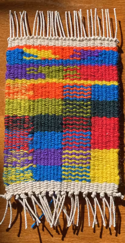
This is a colour harmonies sample for a course I'm doing We were given 7 colours (the three primaries, their three complementaries and a second green as an analogous colour) in fun crayon hues -- no subtlety about this lot. The idea is to explore how and why different colours are put together, and the effect you get doing it. The first exercise was to describe how different combinations are used in paintings (for example; mine, a still life with onions, had red/green complementary colours as well as yellow/purple, for example) and then by making a sample of the ways the colours given can be put together with weaving.
From the bottom up (right to left), there are two primaries (yellow/blue) a square using hatching with both colours and a square where the colours are blended in the weft bundle (exactly like putting different colours in one needle). I worked through the primary colours then paused for a green line, before tackling a triad (purple/green/red and a tetrad (blue, yellow, orange/purple). It was fun -- and bright!
Re: Serindë's Stitching 2025 19 May
Posted: Mon May 19, 2025 6:39 pm
by Mabel Figworthy
Very colourful and very neat!
I will admit though that your description got me a bit muddled as I wasn't sure whether you were describing lots of different projects or just your own. Are the onions part of yours? Or the green hatred (a variation on envy)?
Re: Serindë's Stitching 2025 19 May
Posted: Mon May 19, 2025 8:32 pm
by Serinde
Green hatred due to fat fingers!
The course has basically three exercises: find an image where you can explain the colour plan and see how it works within the image; weave a sample with the basic colours (hues) given to illustrate the possibilities across all of the colours; and then weave a separate piece. Often the students showed several images, and many wove various samples. So the onions are one of my images and the sample is, well, the sample. It’s been suggested I try to weave another similar one, but with more subtle colours (the primary hues’ tint, tone or shade). Not sure I have enough time before I go north, but I might give it a whirl.
Re: Serindë's Stitching 2025 19 May
Posted: Mon Jun 09, 2025 4:54 pm
by Serinde
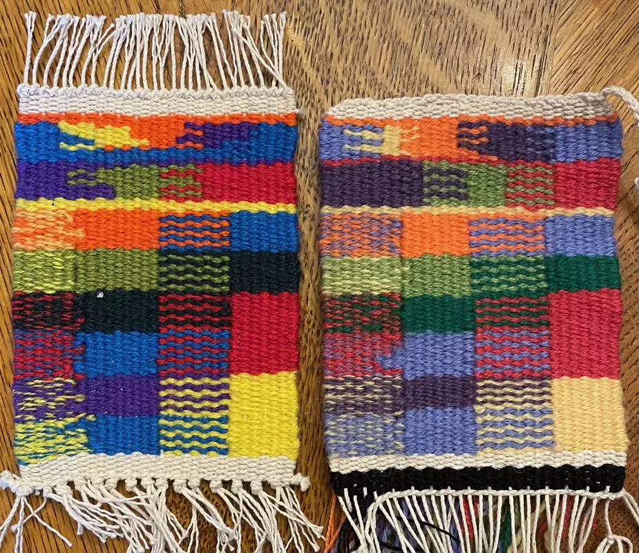
I should also say, to remove any doubt, that the sample is based on the colours assigned to this course. They are supposed to be close to pure primary hues (yellow, red, blue) and complementaries (purple, green [there were two] and orange).
I did do the more subtle variation. Here they are both together so you can really see the difference. In order to find the colour palette, I used an assortment of appropriate yarns: Appleton (4 strands), Paterna (2 strands), Weavers Bazaar (either 2 or 3 strands depending on whether the yarn was medium or heavy). Made for some uneven beating ...
Re: Serindë's Stitching 2025 19 May
Posted: Mon Jun 09, 2025 5:53 pm
by Mabel Figworthy
Interesting to see the difference between the very bright version and the less saturated one (if that's the right term)!
Re: Serindë's Stitching 2025 19 May
Posted: Mon Jun 09, 2025 8:17 pm
by Serinde
Exactly the right term. I prefer the brighter one.